
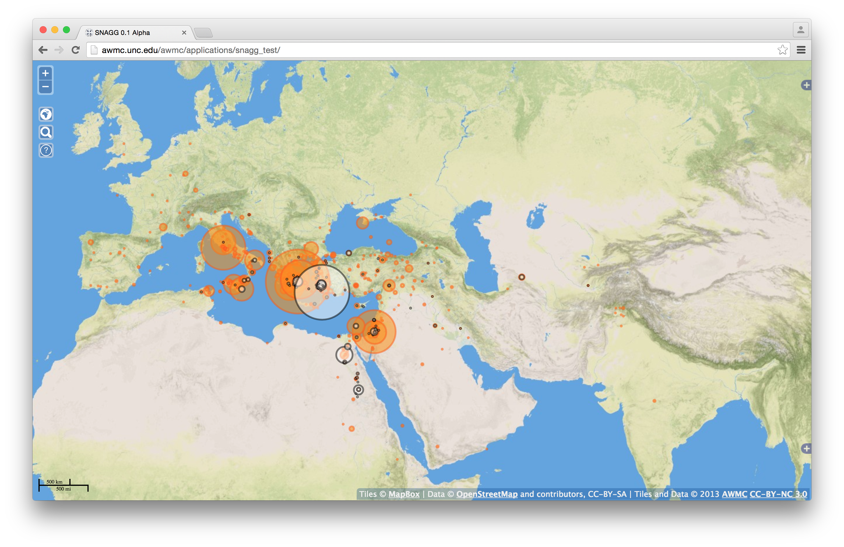
In my previous post I outlined how I used D3.js to display a “raw” JSON output from Gephi. After some hacking around, I am now able to display my Gephi data on an interactive leaflet map!
This is a departure from other work on the subject for a few reasons:
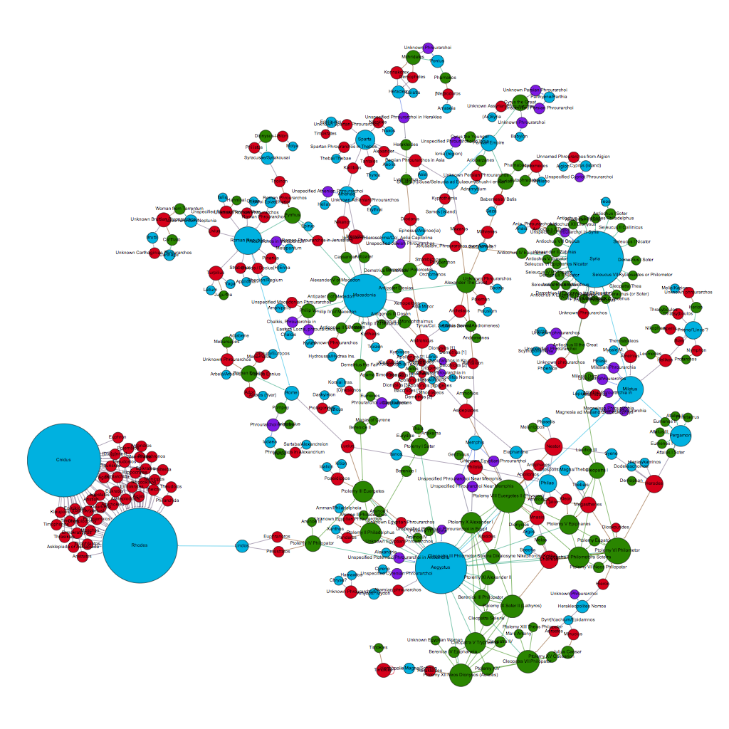
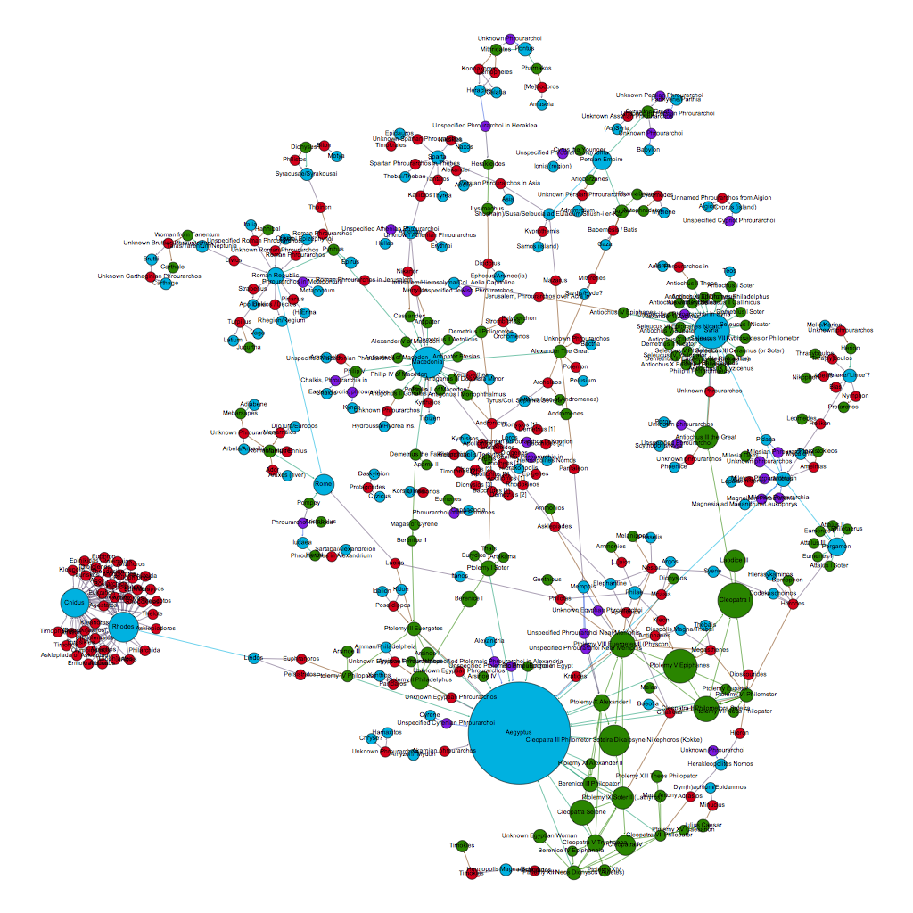
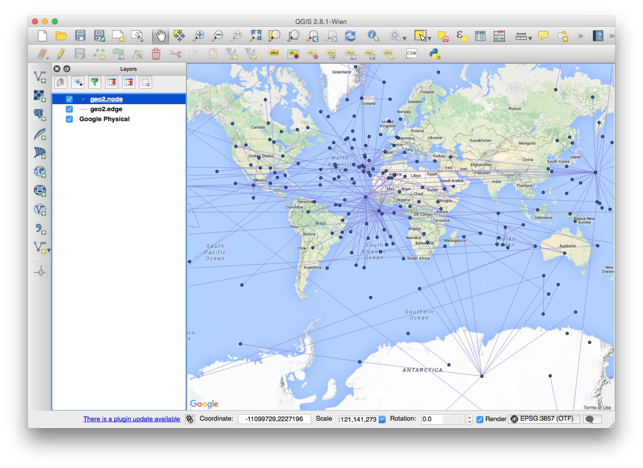
- Not all of my data has geographic information – indeed in many cases a specific longitude / latitude combination is inappropriate and would lend a false sense of permanence to anyone looking at the map. In my case I have names of Greek garrison commanders which have some relation to a place, but it is unclear in some instances if they are actually at a specific place, have dominion over the location, or are mentioned in an inscription for some other reason. Therefore, I need to locate data that has a fuzzy relation to a location (ancient people who may originate, reside, work, and be mentioned in different and / or unknown locations) and locations that may themselves have fuzzy or unknown geography. This is a problem for just about every ancient to pre-modern project, as we do not have a wealth of location information, or even a clear idea of where some people are at any particular moment.
- I want to show how social networks form around specific geographic points which are known, and have those social networks remain “reactive” on zooms, changing map states, etc. This can be expanded to encompass epistolary networks, knowledge maps, etc – basically anything that links people together who may not be locatable themselves.
- Gephi does not output in GeoJSON, and the remaining export options that are geographically oriented require that *all* nodes have geographic information. As this is not my case (see above), the standard export options will not work for me. Also, as part of my work on BAM, I want to create a framework that is as “plug and play” as possible, so that we can simply take Gephi files and drop them into the system to make new modules. Therefore this work has to be reproducible with a minimum of tweaking.
So, let us get to the code!
First things first: You need to make your html, bring in your javascript,and style some elements. I put the css in the file for testing – it will be split off later.
<!DOCTYPE html>

<head>
<meta name='viewport' content='width=device-width, initial-scale=1.0, maximum-scale=1.0, user-scalable=no' />
<!-- Mapbox includes below -->
<script src='https://api.mapbox.com/mapbox.js/v2.2.2/mapbox.js'></script>
<link href='https://api.mapbox.com/mapbox.js/v2.2.2/mapbox.css' rel='stylesheet' />
<script src="https://ajax.googleapis.com/ajax/libs/jquery/2.1.3/jquery.min.js"></script>
<script src="http://d3js.org/d3.v3.js"></script>
</head>
<meta charset="utf-8">
<!-- Will split off css when done with testing -->

<style>
.node circle {
stroke: grey;
stroke-width: 10px;
}

.link {
stroke: black;
stroke-width: 1px;
opacity: .2;
}

.label {
font-family: Arial;
font-size: 12px;
}

#map {
height: 98vh;
}

#attributepane {
display: block;
display: none;
position: absolute;
height: auto;
bottom: 20%;
top: 20%;
right: 0;
width: 240px;
background-color: #fff;
margin: 0;
background-color: rgba(255, 255, 255, 0.8);
border-left: 1px solid #ccc;
padding: 18px 18px 18px 18px;
z-index: 8998;
overflow: scroll;
}
</style>

<body>

<div id='attributepane'></div>

<div id='map'>
</div>
Next, make a map.
<script>
var map = L.mapbox.map('map', 'yourmap', {
accessToken: 'yourtoken'
});

//set the initial view. This is pretty standard for most of the ancient med. projects
map.setView([40.58058, 36.29883], 4);
Pretty basic so far. Next we follow some of the examples that are already in the wild to initiate D3 goodness:
var force = d3.layout.force()
.charge(-120)
.linkDistance(30);

/* Initialize the SVG layer */
map._initPathRoot();

/* We simply pick up the SVG from the map object */
var svg = d3.select("#map").select("svg"),
g = svg.append("g");
Next, we bring in our json file from Gephi. Again, this is pretty standard:
d3.json("graph.json", function(error, json) {

if (error) throw error;
Now we get into the actual modifications to make the json, D3, and leaflet all talk to each other. The first thing to do is to modify the colors (from http://stackoverflow.com/questions/13070054/convert-rgb-strings-to-hex-in-javascript) so that D3 displays what we have in Gephi:
//fix up the data so it is what we want for d3
json.nodes.forEach(function(d) {
//convert the rgb colors to hex for d3
var a = d.color.split("(")[1].split(")")[0];
a = a.split(",");

var b = a.map(function(x) { //For each array element
x = parseInt(x).toString(16); //Convert to a base16 string
return (x.length == 1) ? "0" + x : x; //Add zero if we get only one character
})
b = "#" + b.join("");
d.color = b;
Next, we need to put in “dummy” coordinates for locations that do not have geography. This is messy and could probably be removed with some more efficient coding later. For the nodes that do have geography, the map.latLngToLayerPoint will translate the values into map units, which places them where they need to go. These are simply lat lon attributes in the Gephi file. I also set nodes that are fixed / not fixed, based on the presence of lat/lon data.
if (!("lng" in d.attributes) == true) {
//if there is no geography, then allow the node to float around
d.LatLng = new L.LatLng(0, 0);
d.fixed = false;
} else //there is geography, so place the node where it goes
{
d.LatLng = new L.LatLng(d.attributes.lat, d.attributes.lng);
d.fixed = true;
d.x = map.latLngToLayerPoint(d.LatLng).x;
d.y = map.latLngToLayerPoint(d.LatLng).y;
}
})
Now to setup the links. As we are keyed on attributes and not an index value, we need to follow this fix:
var edges = [];
json.edges.forEach(function(e) {
var sourceNode = json.nodes.filter(function(n) {
return n.id === e.source;
})[0],
targetNode = json.nodes.filter(function(n) {
return n.id === e.target;
})[0];

edges.push({
source: sourceNode,
target: targetNode,
value: e.Value
});
});

var link = svg.selectAll(".link")
.data(edges)
.enter().append("line")
.attr("class", "link");
Now to setup the nodes. I wanted to do a popup on a mouseclick event, but for some reason this is not firing (mousedown and mouseover do work, however). The following code builds the nodes, with radii, fill, and other information pulled from the JSON file. It also toggles a div that is populated with attribute information from the JSON. There is still some work to do at this part: the .css needs to be cleaned up, images need to be resized, and the attribute information for the nodes should be a configurable option when importing the JSON.
var node = svg.selectAll(".node")
.data(json.nodes)
.enter().append("circle")
//display nodes and information when a node is clicked on
//for some reason the click event is not registering, but mousedown and mouseover are.
.on("mouseover", function(d) {

//put in blank values if there are no attributes
var titleForBox, imageForBox, descriptionForBox = '';
titleForBox = '
<h1>' + d.label + '</h1>

';

if (typeof d.attributes.Description != "undefined") {
descriptionForBox = d.attributes.Description;
} else {
descriptionForBox = '';
}

if (typeof d.attributes.image != "undefined") {
imageForBox = '<img src="' + d.attributes.image + '" align="left">';
} else {
imageForBox = '';
}

var htmlForBox = imageForBox + ' ' + titleForBox + descriptionForBox;
document.getElementById("attributepane").innerHTML = htmlForBox;
toggle_visibility('attributepane');
})
.style("stroke", "black")
.style("opacity", .6)
.attr("r", function(d) {
return d.size * 2;
})
.style("fill", function(d) {
return d.color;
})
.call(force.drag);
Now for the transformations when the map state changes. The idea is to keep the fixed nodes in the correct place, but to redraw the “floating” nodes when the map is zoomed in and out. The nodes that need to be transformed are dealt with first, then the links are rebuilt with the new (or fixed) x / y data.
//for when the map changes viewpoint
map.on("viewreset", update);
update();

function update() {

node.attr("transform",
function(d) {
if (d.fixed == true) {
d.x = map.latLngToLayerPoint(d.LatLng).x;
d.y = map.latLngToLayerPoint(d.LatLng).y;
return "translate(" +
map.latLngToLayerPoint(d.LatLng).x + "," +
map.latLngToLayerPoint(d.LatLng).y + ")";
}
}
);

link.attr("x1", function(d) {
return d.source.x;
})
.attr("y1", function(d) {
return d.source.y;
})
.attr("x2", function(d) {
return d.target.x;
})
.attr("y2", function(d) {
return d.target.y;
});

node.attr("cx", function(d) {
if (d.fixed == false) {
return d.x;
}
})
.attr("cy", function(d) {
if (d.fixed == false) {
return d.y;
}
})

//this kickstarts the simulation, so the nodes will realign to a zoomed state
force.start();
}
Next, time to start the simulation for the first time and close out the d3 json block:
force
.links(edges)
.nodes(json.nodes)
.start();
force.on("tick", update);

}); //end
Finally, time to put a function in to toggle the visibility of the div (from here) and close out our file:
function toggle_visibility(id) {
var e = document.getElementById(id);
if (e.style.display == 'block')
e.style.display = 'none';
else
e.style.display = 'block';
}
</script>
</body>
There you have it- a nice, interactive map with a mix of geographic information and social networks. While I am pleased with the result, there are still some things to fix / address:
- The click even not working. This is a real puzzler.
- Tweaking the distances of the simulation – I do not want nodes to be placed half a world away from their connections. This may have to be map zoom level dependent.
- Style the links according to Gephi and provide popups where applicable. This should be easy enough to do, but simply hasn’t been done in this code.
- Tweak the visibility of the connections and nodes. While retaining an option to show the entire network at once, my idea is to have a map that starts out with JUST the locations, and then makes the nodes that are connected to that location visible when you click on it (which would also apply to the unlocated nodes – i.e. you see what they are connected to when you click on them).
- Connected to the above point, the implementation of a slider to show nodes in a particular timeframe. As my data spans a period from the 600s BCE to the 200s CE, this would provide a better snapshot of a particular network at a particular time.
- Implement a URI based system – you will be able to go to address/someEntityName and that entity will be selected with its information pane and connected neighbors displayed. This will result in an RDF file that will be sent to the Pelagios Project.
- Fix up the .css for the information pane.
I will detail further steps in a later post.


You must be logged in to post a comment.